Wednesday, August 22, 2012
Tuesday, July 24, 2012
Topographic Map
Topographic maps represent three dimensional terrain features in a two dimensional format. Contour lines are used to represent the elevation and shape of the land. This example of a topographic map is used to show how firefighters use maps to plan how to fight wild fires. The contour lines are imaginary lines that provide firefighters with valuable information about the terrain.
Cartographic Animation
Source Url: http://www.katrina.noaa.gov/
Cartographic animation is a combination of two dimensional and three dimensional images to portray the changing features in the atmosphere. The attached image is an animation of Hurricane Katrina.
Isopleth Map
Source Urhttp://www.lewishistoricalsociety.com/wiki/tiki-read_article.php?articleId=65
An isopleth map uses contour lines to display information that is collected over an area rather than a particular point. This map displays the sea level pressure over an area.
An isopleth map uses contour lines to display information that is collected over an area rather than a particular point. This map displays the sea level pressure over an area.
Index Value Plot
An index value plot shows data in a linear model in which outliers and influential points can be observed. The attached map shows the value of different indices over time. An index value plot is a valuable tool used to compare data.
Continuously Graded Proportional Circle Map
A continuously graded proportional circle map uses data represented by circles whose size relates to a specific variable. The size of the circle is not necessarily determined by the area of the region.
Isoline Map
Source Url: http://giscommons.org/?page_id=18
An isoline map uses contour lines to represent measured data.
DEM
Source Url: http://tahoe.usgs.gov/GIS.html
A digital elevation model (DEM) is a representation of a terrain's surface. DEM's may be three dimensional or digital models. They are created using elevation information. The attached image is a digital model of the Tahoe region.
Parallel Coordinate Graph
Source Url: http://www.stat.columbia.edu/~cook/movabletype/archives/2007/10/parallel_coordi.html
A parallel coordinate graph is a visual representation of the relationship between various sets of data to include overlap.
A parallel coordinate graph is a visual representation of the relationship between various sets of data to include overlap.
DOQQ
A Digital Orthophoto Quarter-Quadrangle (DOQQ) image is a scale representation of a topographical map area. It is created using aerial photography.
Monday, July 23, 2012
Classed Choropleth Maps
Source Url: http://my.ilstu.edu/~jrcarter/Geo204/Choro/
Classed choropleth maps are aerally averaged and the groups are combined and displayed in intervals.
Correlation Matrix
A correlation matrix is used to show the relationship between pairs of data. It is created in a rectangular array with data placed in rows and columns. The attached map shows the relationship between global equity indices and the Dow Jones Industrial Average.
Similarity Matrix
A similarity matrix shows the relationship and similarity between two sets of data. The attached matrix shows the rating of various baseball players.
Box Plot
A box plot can be used to display numerical data through summaries. It can also help identify outliers. They can be created vertically or horizontally.
Histogram
A histogram is a bar graph in which the height of the vertical rectangles correspond to the values of the data provided on the y axis.
Population Profile Map
A population profile map is created to provide additional information about the population of a particular region. This information could vary from economic makeup to gender and age information. The attached map was created using data acquired during the 2000 census.
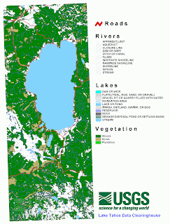
DLG Map
Source Url: http://tahoe.usgs.gov/GIS.html
Digital Line Graphs (DLG) represent a variety of cartographic features. They are created using hypsographic data and by using specific scale maps.
Isopach Map
Source Url: http://www.kgs.ku.edu/PRS/Coal/mineral.html
An isopach map is a type of contour map that displays the rock or sediment thickness of a specific region. The attached map is a representation of the mineral coal thickness across eight different counties.
Isohyet Map
Source Url: http://app2.nea.gov.sg/annual_review_new.aspx
An isohyet map is a type of contour map that displays the rainfall for a particular area over a specified period of time. The attached map portrays the annual rainfall in 2011 for Singapore.
Isotach Maps
An isotach map is a type of contour map that displays the wind speed of a specific area for a specified time.
Statistical Map
Statistical maps show distance between locations based on specific values. The attached map displays the statistical areas of the United States and Puerto Rico as determined by the Census Bureau.
Flow Map
A flow map is used to show movement of a variable over a specified distance. The attached image shows the heat flow from one area to the next.
Bilateral Graph
A bilateral graph is created to show the relationship between two or more quantities. In the attached image, each variable is identified using size and color.
DRG
A Digital Rasta Graphic (DRG) is a topographic map scanned image. The original image is created by the US Geological Survey.
Stem and Leaf Plot
A stem and leaf plot is a graph type that summarizes the data. They are typically utilized when there is a great deal of data to analyze.
Infrared Aerial photo
Source Url: http://www.midwestaerialphoto.com/images.html
An infrared aerial photo can be taken from either a plane or a satellite. The photography equipment uses technology that is sensitive to the infrared spectrum. This image was taken from an airplane using infrared technology.
Isobars Map
An isobars map is a type of contour map that details the air pressure for a particular region. The "L" represents low pressure and the "H" represents high air pressure. These maps can often be seen on the Weather Channel or on the local news weather report.
LIDAR Map
Source Url: http://www.loc.gov/exhibits/911/911-maps.html
A LIDAR Map is a detailed image of a specific area created using laser pulses with a global positioning system. It shows the different earth surface relief features. The attached map is a LIDAR image of the World Trade Center area.
Cartogram
A cartogram uses a different measurement variable other than distance or area to create the image. The attached map is created with the state dimensions based on the number of electoral votes rather than the actual area of each state.
Standardized Choropleth Map
The attached image is a map used to represent that percentage of poulation that is 14 years or older in Canada.
Black and White Aerial Photo
Source Url: http://famouswonders.com/great-pyramids-of-giza/
Black and white aerial photographs use technology that only captures items and colors in the visible spectrum. These aerial pictures may be taken using a plane or satellite. The attached photo is an aerial black and white image of the great pyramids of Giza.
Doppler Radar Map
A Doppler radar is used to determine the quantity, speed, and direction of water droplets suspended in the air. Doppler radar images are often seen on the news as a part of the weather forecast. The attached image is a Doppler radar map of Florida from a local news station.
Sunday, July 22, 2012
Lorenz Curve
A Lorenz Curve is a representation of the wealth of a particular population. The attached image displays the income of families with and without forest income.
Triangular Plot Graph
A triangular plot graph is a representation of three variables as portions of an equilateral triangle. The relationship between the variables can be determined by examining the plot.
Windrose
A wind rose is used to portray the way the direction and speed of wind are distributed in a specific location. The attached image is a wind rose for the Tampa, Florida area.
Climograph
A climograph is a representation of temperature versus precipitation or humidity over a predetermined length of time.
Propaganda Map
A propaganda map is created to express the author's point of view and to influence the reader. The attached map is a representation of how the author believed Ronald Regan saw the world at the time.
Dot Distribution Map
A dot distribution map is an image that portrays one specific variable. The goal of dot distrubtion maps is to make it easier for the reader to see the differences in density. This map displays the population of each area with one dot representing 100,000 people. One can see the differences in population density easily by reading the map.
Hypsometric Map
A hypsometric map is a two dimensional map that communicates three dimensional data. The third dimension may be relief features or some other aspect superimposed on the area. The third dimension can be displayed using color, shaping, contour lines, or raised relief.
Planimetric Map
Source Url: http://www.ncdot.gov/doh/preconstruct/highway/photo/Products/Planimetric_maps_default.html
A planimetric map is a map that does not display relief features. A road map is an example of a planimetric map. The attached map is used to create designs for transportation products. It is a two dimensional map that does not display any of the possible surrounding relief features.
Subscribe to:
Comments (Atom)


